CONCEPT

Proof of Concept

Industrial Intelligence Dashboard

Proof of Concept / Data Experience

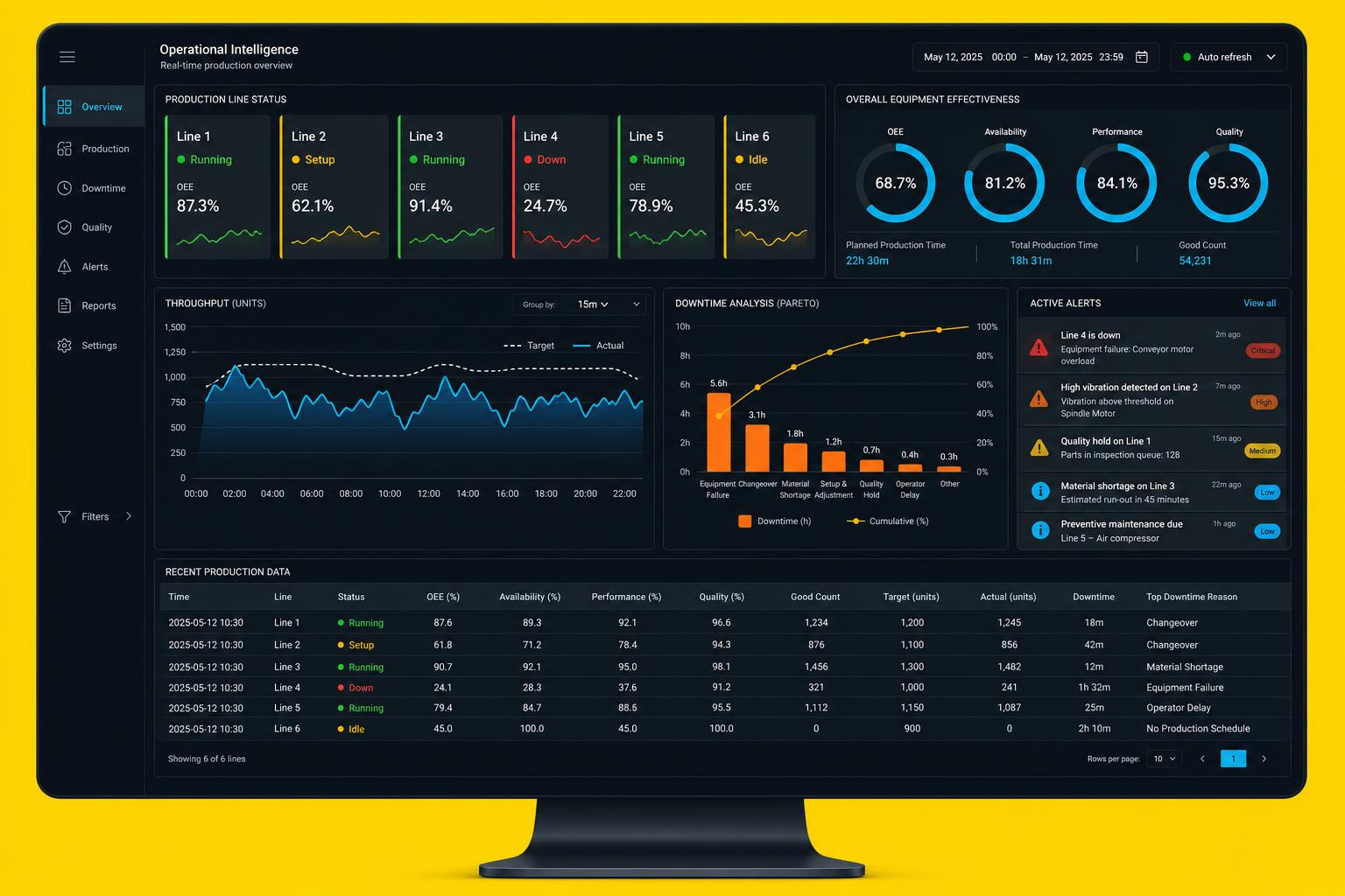
A proof of concept for an operational intelligence dashboard that turns production telemetry into decisions readable from across a factory floor.

  • Proof of Concept
  • Data Visualization
  • Operational Intelligence
  • Enterprise UX
  • Design System
Industrial Intelligence Dashboard concept interface screens

Project overview

A self-initiated data-experience exploration: role-specific dashboards for operators, supervisors and directors, built on one metric grammar covering line status, throughput, downtime analysis and alerting.

Type
Proof of Concept
Discipline
Data Experience
Year
2026

The opportunity

Industrial data is abundant and unreadable. The design opportunity is a visual grammar where OEE, throughput and downtime mean the same thing on every screen, and where an alert ranks by consequence rather than sensor order.

The challenge

The same dashboard has to work on a wall-mounted floor screen at three metres and a laptop at fifty centimetres, under glare, with gloves, while carrying enough density for a director to compare lines.

Design approach

  • Catalogued the metrics an operational platform typically exposes and grouped them by the decision they serve
  • Built a shared metric taxonomy so every chart uses the same definitions
  • Tested chart legibility at distance, in high ambient light and in dark mode
  • Designed alert ranking around estimated production impact rather than recency

Product strategy

  • Role-specific views: operator, supervisor and director need different truths from one dataset
  • Rank alerts by consequence, with severity, age and affected line always visible
  • Charts sized for the furthest reader, not the nearest
  • One visual grammar across every metric and every screen size
FLOWS

User experience

  • Line status readable in under two seconds from the top of the screen
  • Root cause reachable from shift to machine to event in three interactions
  • Dark mode as the default for floor conditions, with tested contrast ratios
  • Every number carries its window and its target

Key user flows

  1. 01

    Scan

    Line status tiles give the floor state before anyone reads a chart.

  2. 02

    Detect

    Ranked alerts with severity, affected line and estimated impact.

  3. 03

    Diagnose

    Downtime pareto and throughput overlay narrow the cause window.

  4. 04

    Drill

    Shift to machine to event, keeping the time window locked.

  5. 05

    Compare

    Cross-line and cross-period comparison on normalised metrics.

UI exploration

Line overview screen from the Industrial Intelligence Dashboard concept

Line overview

Status tiles with OEE, trend spark and colour-plus-shape state encoding.

Downtime analytics screen from the Industrial Intelligence Dashboard concept

Downtime analytics

Pareto with cumulative curve, filtered to the selected window.

Alert centre screen from the Industrial Intelligence Dashboard concept

Alert centre

Consequence-ranked list with severity pills and acknowledge actions.

Production table screen from the Industrial Intelligence Dashboard concept

Production table

Dense record view with sorting, sticky headers and inline status.

Design system

  • A charting kit with fixed rules for axis, legend, grid weight and empty data
  • Status encoding that never relies on colour alone
  • Distance-tested type scale with a separate floor-screen density mode
  • Alert severity tokens shared across tiles, lists and tables

Prototype

An interactive dashboard prototype driven by simulated line telemetry, exercised across running, setup, idle and down states, and reviewed on both a large display and a laptop.

Tools & technologies explored

  • React
  • TypeScript
  • D3
  • WebSockets
  • Design tokens
  • Figma

Design outcomes

What the exploration produced. No commercial launch, no performance claims — design artefacts and thinking.

A metric grammar

One definition and one visual treatment per metric across every view.

Consequence-first alerting

A ranking model that puts the costliest problem at the top of the list.

Two-distance layout

A density mode that keeps the same screen legible at three metres and fifty centimetres.

A charting kit

Reusable visualisation components with documented empty and error behaviour.

Key learnings

  • Most industrial dashboards fail on hierarchy, not on data quality
  • Colour alone is unusable on a floor screen under changing light
  • A three-click path to root cause is a layout constraint, not a feature
  • Normalisation is what makes cross-line comparison honest

Future opportunities

  • Predictive maintenance surfaced inside the same alert model
  • Shift handover summaries generated from the day's events
  • Mobile companion for maintenance leads away from a terminal
  • Voice or glove-friendly acknowledgement interactions

Let's build something
people can't ignore.