CONCEPT

Self-Initiated Concept

AI Travel Booking

Product Concept / AI UX

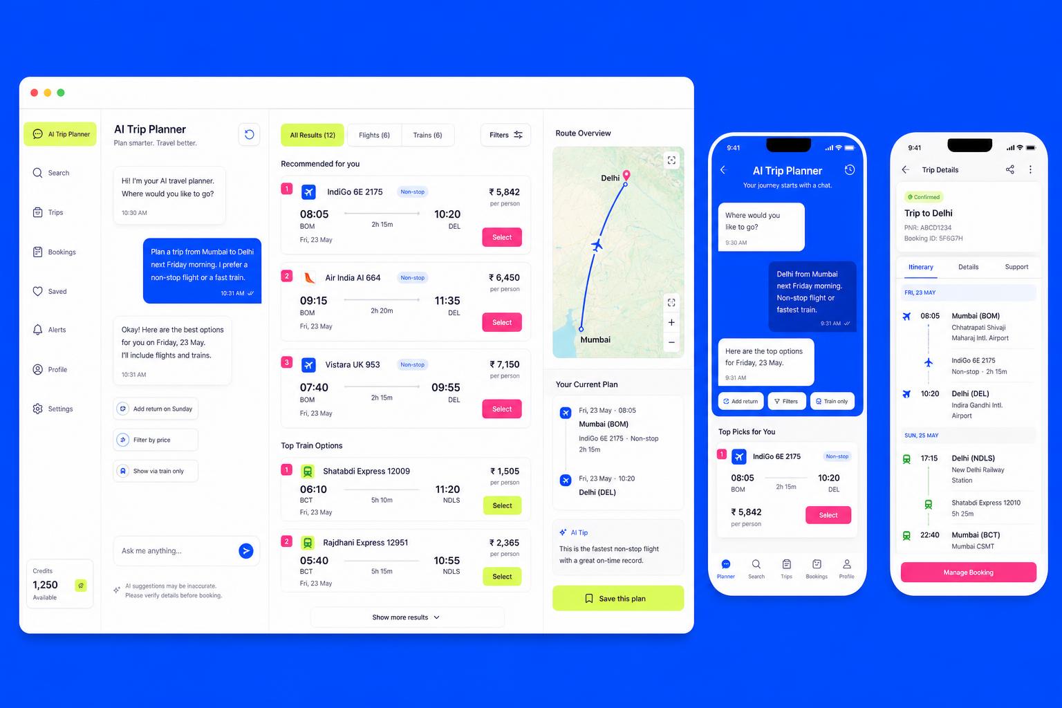
A self-initiated concept for an AI-assisted travel and ticket booking platform where planning happens in conversation instead of filter stacking.

  • Product Concept
  • AI UX
  • Conversational Design
  • Mobile & Web
  • Design System
AI Travel Booking concept interface screens

Project overview

An internal exploration into what booking could feel like if an assistant did the searching. We designed a conversational trip planner, an explainable results model and a single-surface checkout across mobile and desktop, then built the flows as an interactive prototype.

Type
Self-Initiated Concept
Discipline
AI UX
Year
2026

The opportunity

Travel search still asks people to translate intent into filters — dates, flexibility, budget, party size — before anything useful appears. Language models make it possible to accept intent directly, which reopens almost every screen in the funnel.

The challenge

A conversational layer is easy to demo and hard to trust. The exploration had to answer three questions: how does an assistant show its reasoning, what happens when it is wrong, and how do chat and structured UI coexist without duplicating each other.

Design approach

  • Mapped a conventional booking funnel end to end and marked every step that exists only to collect parameters
  • Ran informal think-aloud sessions with a clickable prototype to test how people phrase travel intent
  • Reviewed conversational patterns across adjacent product categories for what breaks at scale
  • Prototyped chat and structured results as one surface rather than two modes

Product strategy

  • Intent first: one natural-language input replaces the filter stack, with structured controls as refinement
  • Always explain the recommendation — a plain-language reason plus a cheaper and a faster alternative
  • Collapse checkout into a single confirm surface with progressive disclosure
  • One design system, two platforms, so mobile and web never drift
FLOWS

User experience

  • The assistant answers with options, never with prose alone
  • Every AI suggestion is editable in one tap — refinement never restarts the search
  • Uncertainty is labelled, not hidden; the prototype shows confidence and a manual path
  • The itinerary is the persistent object; chat is a way to change it

Key user flows

  1. 01

    Express intent

    A single input parses destination, dates, flexibility and budget from ordinary language.

  2. 02

    Compare options

    Ranked flight and rail results with the reason each one surfaced.

  3. 03

    Refine in place

    Chips and follow-up questions adjust the search without losing context.

  4. 04

    Confirm

    Seats, extras and payment resolve on one screen with inline validation.

  5. 05

    Manage the trip

    Live itinerary, changes and alternatives handled from the same object.

UI exploration

Conversational search screen from the AI Travel Booking concept

Conversational search

Chat and results share one canvas; the assistant column never covers the options.

Explainable result cards screen from the AI Travel Booking concept

Explainable result cards

Each card carries price, duration, a reason chip and a one-tap alternative.

One-surface checkout screen from the AI Travel Booking concept

One-surface checkout

Passenger details, extras and payment as progressive sections instead of pages.

Itinerary detail screen from the AI Travel Booking concept

Itinerary detail

Timeline view with status, documents and change actions for the whole trip.

Design system

  • Type scale and spacing tokens shared across web and mobile artboards
  • A result-card family covering flight, rail, bundle and empty states
  • Conversational components: prompt chips, assistant message, confidence label, correction affordance
  • Documented empty, loading, error and low-confidence states for every AI surface

Prototype

A high-fidelity clickable prototype covering the full path from first prompt to confirmed itinerary, plus mobile variants of the planner and trip detail screens, used for internal critique and informal usability sessions.

Tools & technologies explored

  • React
  • React Native
  • TypeScript
  • Design tokens
  • Figma
  • Prototype LLM orchestration

Design outcomes

What the exploration produced. No commercial launch, no performance claims — design artefacts and thinking.

A booking model without filters

The concept demonstrates that intent parsing plus refinement chips can replace a six-field search form.

An explainability pattern

A reusable reason-chip and alternative pairing that makes an AI recommendation auditable at a glance.

Checkout on one surface

A layout that holds seats, extras and payment together without error pages.

A cross-platform kit

Shared tokens and components proving the same system can carry native and web.

Key learnings

  • People phrase intent in fragments, not sentences — parsing has to tolerate partial input
  • A visible correction path matters more than accuracy; trust follows recoverability
  • Chat is a poor place to compare; structured results still do the heavy lifting
  • Explaining a recommendation costs one line of copy and changes how the whole product reads

Future opportunities

  • Multi-traveller planning with shared, negotiable itineraries
  • Disruption handling: rebooking proposals generated the moment a service changes
  • Voice-first planning for hands-busy contexts
  • An accessibility pass on conversational patterns with screen-reader users

Let's build something
people can't ignore.