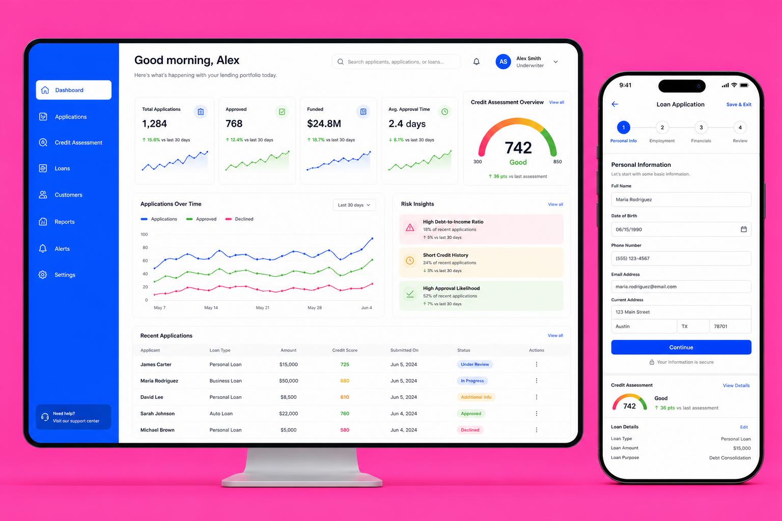
Portfolio dashboard
Pipeline volume, approval mix and turnaround trends with drill-through to any case.
Self-Initiated Concept
Product Concept / Fintech UX
A concept exploring how a lending platform could pair a plain-language application journey with an underwriter workspace built for decisions, not data entry.
A self-directed exploration of digital lending as two connected products: a save-and-resume application for borrowers, and an underwriting workspace where credit signals, risk insights and documents live in one case view.
Most lending interfaces are forms bolted to legacy decisioning. The interesting design problem is not the form — it is presenting a credit picture so a human can make a defensible decision quickly, and telling the applicant the truth while they wait.
Regulated products punish ambiguity. The concept had to show risk signals in context without implying automated approval, keep an audit trail visible, and stay legible at the data density underwriters actually work in.
Personal, employment and financial sections with inline validation and clear document asks.
Score, factor breakdown and risk insight cards assembled into one case view.
Underwriter reviews suggestion, evidence and policy checks, then records a rationale.
Applicant sees stage, expected timing and the exact item blocking progress.
Portfolio dashboard for pipeline, exposure and turnaround trends.
Pipeline volume, approval mix and turnaround trends with drill-through to any case.
A score gauge paired with contributing factors and comparison to prior assessment.
Ranked insight cards with severity, prevalence and a link to the underlying rule.
Stepped form with progress, secure-entry cues and a persistent save state.
A connected prototype covering the borrower application on mobile and the underwriter workspace on desktop, including empty, pending, additional-info and declined states.
What the exploration produced. No commercial launch, no performance claims — design artefacts and thinking.
One column that holds documents, credit signals and policy checks without tab-hopping.
A score-plus-factors pattern that keeps the human accountable for the decision.
An applicant-facing tracker that names the blocking item instead of a generic 'in review'.
Table, chart and pill components that hold up at real record counts.